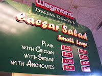
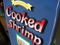
These signs, and a majority of what i do for signage at Wegmans, uses what i call "cut-out lettering." It is using foamcore (or sometimes called foamboard) to create the actual letters so that they stand out from the sign. I use various layers to accentuate some signs more than others. Usually, the bigger, the more room for layers. Sometimes I've cut out letters for 'small' signs and it gets very tedious. I go thru hobby blades for my knife like its nothing. I get them by the 100 pack and probably go thru 30 or so a week (though i've never really added them up. Just guestimating).
Please click on the following thumbnails for a larger picture.


 Every now and then, I'm actually allowed the time and the particular project to lend some of my DRAWING skills to play. I really had a fun time doing caricatures of the Video Dept. staff. MOST of them were good natured about their rendering, though it is rumoured i made one girl cry (the redhead, Rachel). i can't help it if she actually LOOKS like that
  (sorta!). hehe. And the sunflower is watercolor. I don't really consider myself a "painter" - more of an "illustrator" - but i was really impressed with myself and how good it came out. Effective and bright. This sign goes atop a spinning display that has four sides. At the time, it's holding Newman's cookies.
p.s. how do you like my "Movie Pick?" I didn't even see it! ;-)
Christine - - Snakes on a Plane? That is a FINE film, and a GREAT movie pick. OK, I haven't seen it either, and it looks BAD. Your sign looks great though - I love the charicatures!
ReplyDelete